

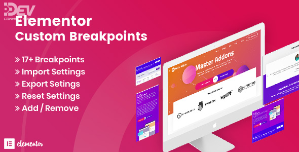
Elementor Custom Breakpoints v1.0.3 is a powerful extension for the Elementor page builder, allowing you to go beyond the default responsive settings and create fully customized breakpoints tailored to your website’s unique needs. Whether you’re designing for extra-large desktops or tiny mobile screens, this add-on gives you the flexibility to fine-tune layouts with precision.
Design for Any Screen Size
With this plugin, you’re no longer limited to just desktop, tablet, and mobile views. Add, modify, or remove breakpoints to suit a wide range of devices—ideal for web designers, developers, and agencies building pixel-perfect, responsive websites.
Seamless Integration with Elementor
Elementor Custom Breakpoints integrates directly into Elementor’s existing interface, making it easy to adjust breakpoints from the same visual editor you already use. No coding required—just drag, drop, and preview across multiple custom screen sizes.
Boost UX and SEO
Responsive design is crucial for both user experience and search engine optimization. With this tool, you can ensure your content looks perfect and loads smoothly on every device, helping to reduce bounce rates and increase engagement.